Getting yourself out there
Posted: February 3, 2012 Filed under: Uncategorized Leave a commentBuilding an online presence is important for any designer/illustrator wanting to get their work and presence more visible to the public. What are the steps you have to take to get you and your work out there? It seems like a daunting task, with so much visible competition from all over the world. Here are a few tips I think are helpful in expanding your online presence.
1. Blog, Tweet
It’s important to blog and tweet and connect with users from all over the world. Blogging and tweeting allows for people to get a sense of who you are, what your interests are and what your work is like. It’s also a great platform to connect with people you otherwise wouldn’t get a chance to.
2. Submit your work to blogs, magazines
Plenty of independent magazines are looking for illustrators and designers to contribute and volunteer. Getting published is a sure way to get noticed, as well as gain experience.
Click here to sign up for a twitter.
Social Media Conduct
Posted: January 27, 2012 Filed under: Uncategorized Leave a commentSocial Networking is an important aspect of our day to day lives. Whether you use your social media outlets for personal or professional use, it’s important to limit what you post and understand what you’re hoping to gain from your social networking experience. If your hoping to gain followers and promote your work and business, it’s crucial you stay professional.
1.Connecting: Let people know who you are and what you want
It’s important to let people know why you wish to connect with them. By doing so you can form an online friendship that could end up benefiting you. Maybe you connect with an artist who wants to collaborate. Maybe you can connect with a potential employer. It’s good to know who’s watching what you post.
2. Follow, add, friend: Want to be besties?
I have 2 separate uses for social media. I use certain platforms to stay informed on people in my life and keep up with what is happening in their lives, and allow people to see what is going on in mine. So, for social media networks like Facebook, I will only add people I know or have met. I don’t use facebook to network or promote my work, rather for personal use.
When I do use social media to network and promote myself, I will add anyone who friends me. It’s important to get your work and yourself out there as much as possible so requesting friends and adding as much people as possible is the best way possible to do so.
3. Privacy, boundaries and safety: Make sure to edit what you say
As I’m getting closer to my career path, It’s crucial that I limit what I post. I want to be known as a professional and a responsible young adult, so I definitely limit what I post on certain social media networks. I make sure not to post anything offensive, as well as watch my grammar. It’s important to keep your personality though and not edit yourself too much.
On facebook, I do post things I wouldn’t necessarily post to public social media websites.
4. Signal to noise: TMI, girl
Some people post way too much information to their social media sites. People are judgemental, especially over the internet, so when you post certain things that make you look immature and questionable it allows people to form an even more judgmental opinion on your character and who you are. The material and content you post to your social media websites are telling of your character and beliefs, so it’s crucial you limit it and be careful what you post.
5. Personal data and sharing: Can I get your address?
I limit a lot of my information depending on what platform I’m using. When using a social media network to promote myself and my work, I will share my location and age, but wouldn’t share my cell phone number or address. On facebook I do display my number but only because I don’t add people I’ve never met.
6. My networking needs and uses: What do I want to gain from this?
I use facebook for personal use. It’s a great way to stay connected with the people in your life.
I use twitter to connect with local firms and designers, as well as people from around the world. It’s a great tool to use to allow people to get a sense of who you are, and your personality.
2 awesome art blogs
Posted: January 20, 2012 Filed under: Uncategorized | Tags: art, blogs Leave a commentBauBauhaus is my go to website for finding inspiration. The website layout is incredibly clean and simple and features fascinating design, typography, photography and illustration pieces from all over the world. The main page features continuous scrolling which makes navigating through all of the imagery easy. At the top of the website are links to the different categories featured on the website in case you’re looking to view specific types of works. Another great feature to BauBauhaus is once you click on a piece it brings you to a separate page with similar works. If you’re looking to view beautiful design work I highly recommend this website.
BOOOOOOOM! has been a favorite of mine since I could remember. The blog features artists from all over the world who work in all different types of mediums. The work featured ranges from typography to street art to illustrations & photography. The website layout definitely isn’t lacking in personality, its bright and fun and features an interesting background. The layout doesn’t take itself too seriously and that’s what I like about it. A lot of blogs seem really minimal and plain so it’s refreshing to see a blog this well known and respected stick with a more laid back look. I also enjoy the fact that users can comment on the works of art and give their opinion on the pieces. BOOOOOOOM! is always a great place to visit when you’re looking to be inspired and learn about new & upcoming artists.
The Best.
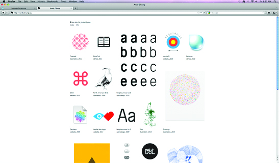
Posted: January 6, 2012 Filed under: Uncategorized Leave a commentAndy Chung, a designer and illustrator located in Vancouver, BC, Canada takes an incredibly minimal and simplistic approach with the design of his website, and I can’t help but love it. Personally speaking I think when displaying your work, you shouldn’t clutter and overdo the overall design of your website, but rather focus on letting your work be displayed in a clean & organized manner. Andy Chung displays all of his work on one page, using thumbnails to guide viewers to a larger version of his pieces that are accompanied with a description of the piece below. The site is easy to navigate, and the work really stands out and is displayed beautifully.
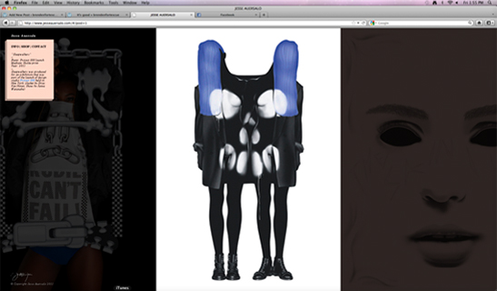
Jesse Aurersalo is an incredibly innovative illustrator. His personal portfolio website stays true to the style of his illustrations. His illustrations remind me of photographs you’d see in a fashion magazine. His website allows you to click to the left or right and as you do, it scrolls and highlights the piece of work you just clicked, almost as if you’re flipping through an online magazine. Jesse set up his website to ensure the viewer is solely focusing on his works of art, and nothing more. On the top left is a box with a link to information about him and a link to his shop. He leaves unnecessary elements out of his website and draws the viewer into his work. The website is successful, in my opinion, because I’m drawn into his world and his style of illustration. The website truly compliments his aesthetic.


